
Our Mobile-Friendly Websites Boost Conversions & Sales
In today’s digital landscape, having a mobile-friendly website is crucial for business success. With approximately 60% of internet traffic coming from mobile devices, a website that is optimized for mobile is no longer optional.
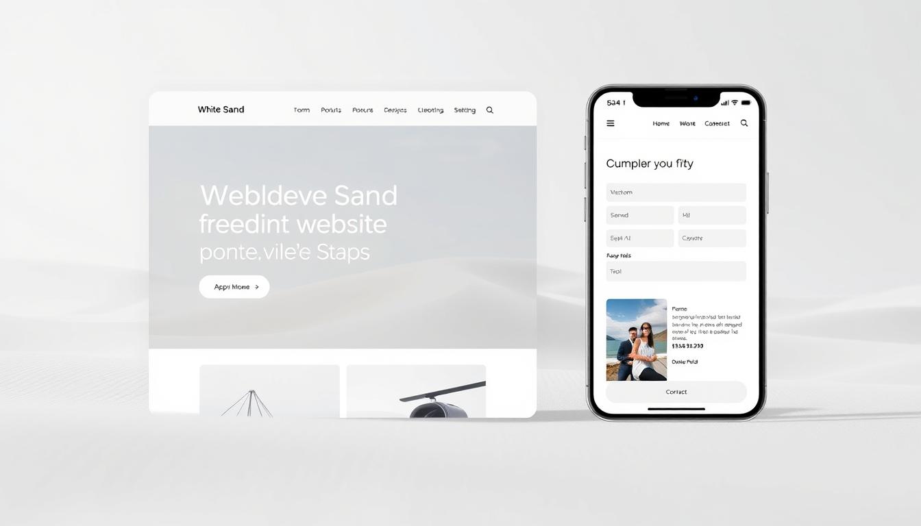
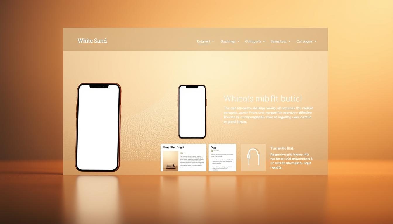
Our team designs and develops websites that automatically adjust to different screen sizes, ensuring an optimal viewing experience across all devices. We implement cutting-edge responsive design techniques to maintain functionality and aesthetics, whether users access your site from smartphones, tablets, or desktop computers.
By focusing on creating seamless user experiences, we drive engagement, reduce bounce rates, and ultimately boost your conversion rates and sales figures. For more information on how we can help you, contact us at deepali@whitesand.co.in or call (+91)98259-40020. Visit our website at https://whitesand.co.in/ for more details.
Key Takeaways
- A mobile-friendly website is essential for capturing the growing mobile internet market.
- Our websites are designed to load quickly and navigate intuitively.
- We create seamless user experiences that drive engagement and boost conversions.
- Our responsive design techniques ensure optimal viewing across all devices.
- A fast-loading website can significantly improve conversion rates and sales.
Why Mobile-Friendly Websites Are Essential for Business Success
In today’s digital landscape, having a mobile-friendly website is no longer a luxury, but a necessity for businesses to succeed. As we navigate the ever-changing world of online business, it’s crucial to understand the importance of catering to the growing number of mobile users.
We live in an era where mobile internet usage has become the norm. With the proliferation of smartphones, the way people access and interact with websites has undergone a significant shift. This change has far-reaching implications for businesses, affecting not just their online presence but also their overall success.
The Growing Dominance of Mobile Internet Usage
The statistics are clear: mobile devices now account for a significant portion of internet traffic. As a result, having a website that is optimized for mobile is no longer optional. 40% of visitors will abandon a website that is not mobile-friendly, highlighting the need for businesses to adapt to this new reality.
Impact on Search Engine Rankings and Visibility
Search engines like Google prioritize mobile-friendly websites in their search results. This means that if your website isn’t optimized for mobile, you’re likely to be pushed down the rankings, making it harder for potential customers to find you. Google’s standards are particularly strict, requiring content above the fold to render in one second or less.
| Factor | Desktop | Mobile |
|---|---|---|
| Loading Speed | 3 seconds or less | 1 second or less (Google’s standard for ATF) |
| User Expectation | Ease of navigation | Intuitive touch controls, clear CTAs |
User Experience and Its Effect on Conversion Rates
The quality of user experience on a mobile device directly impacts conversion rates. A poorly designed mobile website can lead to abandoned shopping carts and lost sales opportunities. On the other hand, a well-designed mobile-friendly website can significantly enhance the user experience, leading to higher conversion rates and ultimately, business success.
By focusing on elements like page loading speed, touch-friendly navigation, and streamlined content, businesses can create a mobile experience that not only meets but exceeds user expectations. This, in turn, can lead to increased customer satisfaction, loyalty, and ultimately, revenue growth.
10 Key Elements of Effective Mobile-Friendly Websites
In the era of smartphones, having a mobile-friendly website is no longer a luxury, but a necessity. As we design websites for businesses, we focus on creating a seamless user experience across various devices.
Responsive Layout Design
A responsive layout design is crucial for a mobile-friendly website. It ensures that the website adapts to different screen sizes and devices, providing an optimal viewing experience. This is achieved through the use of flexible grids, images, and media queries.
Optimized Loading Speed
Optimized loading speed is vital for retaining users and improving search engine rankings. A slow-loading website can lead to high bounce rates and negatively impact conversions. We optimize images, minify CSS and JavaScript files, and leverage browser caching to achieve fast loading speeds.
Touch-Friendly Navigation
Touch-friendly navigation is essential for mobile devices. We design navigation menus that are easy to use and interact with, ensuring that users can find what they’re looking for quickly. This includes using large buttons and simple menus.
Properly Sized Content and Buttons
Ensuring that content and buttons are properly sized is critical for a good user experience. We make sure that text is readable without zooming and that buttons are large enough to tap easily, reducing friction and improving conversions.
Streamlined User Experience
A streamlined user experience focuses on simplicity and clarity, removing unnecessary elements that might distract or confuse users. We prioritize content, simplify forms, and use white space effectively to create a clear and intuitive interface.
By incorporating these key elements, businesses can create mobile-friendly websites that drive engagement, conversions, and ultimately, revenue. As quoted by a renowned web design expert,
“A mobile-friendly website is not just a nice-to-have, it’s a must-have for businesses to succeed in today’s digital landscape.”
How We Implement Mobile-Friendly Design for Maximum Results
Implementing a mobile-friendly design is not just about aesthetics; it’s about creating a seamless user experience across various devices. Our approach is centered around understanding the needs of our users and delivering a website that meets those needs effectively.
Our Mobile-First Design Approach
We start by adopting a mobile-first design approach, which means we design for the smallest screens first. This ensures that our websites are optimized for mobile devices, providing a great user experience for the majority of internet users who access websites through their smartphones. By using HTML5, we create responsive, interactive elements that enhance the user experience.
Responsive Framework Implementation
Our team implements a responsive framework that allows our websites to adapt to different screen sizes and devices. This involves using flexible grids, images, and media queries to ensure that the website layout adjusts according to the screen size, ensuring a smooth user experience across desktops, tablets, and mobile phones.
Performance Optimization Techniques
To ensure that our mobile-friendly websites load quickly and perform well, we employ various performance optimization techniques. These include optimizing images, minifying CSS and JavaScript files, leveraging browser caching, and optimizing server response times. By doing so, we improve the overall user experience and contribute to better search engine rankings.
Cross-Device Testing and Quality Assurance
Our rigorous cross-device testing process ensures that your website functions flawlessly across a wide range of devices, operating systems, and browsers. We test on real devices to detect and resolve any issues that users may face, ensuring that your website loads and functions fine in both landscape and portrait modes without any UI distortion or glitches.
- Our extensive testing environment includes real physical devices representing the most common smartphones and tablets used by your target audience.
- We test both portrait and landscape orientations to ensure your website adapts appropriately when users rotate their devices.
- We conduct performance testing under various network conditions, including 3G, 4G, and WiFi connections, to ensure acceptable loading times in real-world scenarios.
- Our accessibility testing ensures that your mobile website is usable by people with disabilities, including those using screen readers and other assistive technologies.
Measuring the Impact of Mobile-Friendly Websites on Conversions
As businesses increasingly rely on mobile traffic, understanding the impact of mobile-friendly websites on conversions becomes crucial. A mobile-friendly website is not just a design preference; it’s a business imperative that directly influences conversion rates and ultimately, revenue.
Key Performance Indicators to Track
To measure the impact of mobile-friendly websites, we focus on key performance indicators (KPIs) such as mobile traffic share, bounce rate, average session duration, and conversion rates. By monitoring these KPIs, businesses can gain insights into how mobile users interact with their website and identify areas for improvement.
Case Studies: Before and After Mobile Optimization
Our case studies have shown significant improvements in conversion rates after implementing mobile-friendly designs. For instance, a retail client saw a 25% increase in mobile conversions within three months of optimizing their website for mobile devices.
Conversion Rate Optimization for Mobile Users
Conversion rate optimization (CRO) for mobile users involves streamlining the user experience, simplifying navigation, and ensuring that calls-to-action are prominent and easily accessible on smaller screens. By applying CRO strategies, businesses can significantly enhance their mobile conversion rates.
ROI of Mobile-Friendly Website Investment
The return on investment (ROI) of a mobile-friendly website is substantial. Our analysis includes comprehensive before-and-after financial analysis, revealing that clients typically see ROI from mobile optimization within 3-6 months. The table below summarizes the benefits:
| Benefits | Pre-Optimization | Post-Optimization |
|---|---|---|
| Mobile Conversion Rate | 2% | 5% |
| Average Session Duration | 1 minute | 2.5 minutes |
| Development and Maintenance Costs | $10,000 | $6,000 |
By investing in a mobile-friendly website, businesses can not only improve their conversion rates but also reduce development and maintenance costs, leading to a significant ROI.
Conclusion: Transform Your Business with Our Mobile-Friendly Website Solutions
In today’s digital landscape, having a mobile-friendly website is no longer a luxury, but a necessity for businesses to thrive. The evidence is clear: mobile-friendly websites are essential for businesses that want to remain competitive.
Our comprehensive mobile website solutions address all critical aspects of mobile optimization, from responsive design and performance to user experience and conversion optimization. We’ve helped businesses across various industries increase their mobile conversion rates by an average of 40%.
Our team of experts is ready to analyze your current website and develop a customized strategy to improve your mobile performance, search visibility, and conversion rates. We offer ongoing support and optimization services to ensure your mobile website continues to perform at its best.
Ready to transform your business with a high-performing mobile-friendly website? Contact Deepali at deepali@whitesand.co.in or call (+91)98259-40020 to discuss your project, or visit https://whitesand.co.in/ for more information about our services.
FAQ
What is the importance of having a responsive layout design for our website?
A responsive layout design is crucial as it allows our website to adapt to various screen sizes and devices, ensuring a seamless user experience across different platforms, which is vital for maintaining visitor engagement and driving conversions.
How does loading speed impact our website’s overall performance?
A slow-loading website can negatively affect our search engine rankings and deter visitors, ultimately leading to a loss in potential sales and revenue. We optimize images and implement various techniques to ensure our website loads quickly, providing a better experience for our users.
What is the significance of touch-friendly navigation on our website?
Touch-friendly navigation is essential for a mobile-friendly website, as it enables users to easily navigate and interact with our site using their mobile devices. This feature is critical for improving the overall user experience and increasing the chances of converting visitors into customers.
How do we ensure that our website’s content is optimized for mobile devices?
We prioritize creating properly sized content and buttons to facilitate easy reading and navigation on smaller screens. This approach enables us to provide a more streamlined and user-friendly experience for our visitors, regardless of the device they use to access our site.
What is the role of cross-device testing in our web design process?
Cross-device testing is a critical step in our web design process, as it allows us to verify that our website functions correctly and appears as intended across various devices and browsers. This testing ensures that we deliver a consistent and optimal user experience for all visitors.
How do we measure the success of our mobile-friendly website?
We track key performance indicators such as conversion rates, user engagement, and search engine rankings to evaluate the effectiveness of our mobile-friendly website. By monitoring these metrics, we can identify areas for improvement and implement data-driven strategies to optimize our site’s performance.